These are the final directions I've decided to go with: completely mocked up.
Colleen Ireland
Thanks to everyone who is interested in my blog. It will be documenting my process in Design school at KU. I hope everyone enjoys it, and feel free to comment on anything you see.
Monday, February 6, 2012
Wednesday, February 1, 2012
More Refinements
I applied new graphics and colors to the packaging as well as came up with a new concept of making a hamburger sleeve instead of using a box and it would just be one sheet of paper that is wrapped and folded to secure it. I made a sticker that would be used to hold the hamburger sleeve together, as well as a cup wrap, but I don't think I'm going to end up pursuing that idea.
Tuesday, January 31, 2012
Prototype
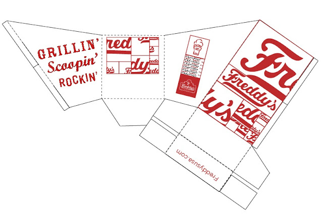
I had to incorporate the pattern designs I had come up with by using Freddy's existing imagery and editing it, and apply it to a template for a prototype.
This is the fry container prototype, which is 'green design' because it is all one piece and requires no glue or fasteners in order to stay together.
Thursday, January 26, 2012
Original Mock-ups
These are a few of the simple mock-ups I came up with to solve the problem of having nowhere to put the condiments. Most of the designs involve flaps or little trays that come out of the container that give you a place to put ketchup/mustard, while still being compact. We haven't started on design aspects at this point.
Wednesday, January 25, 2012
Book Cover Redesign
Book Cover Redesign
For this project, we are taking a group of three books that we feel have a relevant connection to each other such as a similar theme, time period, or author. We have to take these books and redesign their covers in a way that is cohesive, creative, and a new viewpoint that hasn't been used before.
The three books I decided on are The Book Thief by Markus Zusak, The Devil's Arithmetic by Jane Yoder, and A Separate Peace by John Knowles. They are all related in that they are all focused around youth in the time of the world wars, their coming of age stories, and how the role the past plays in their presents and futures.
Here is the initial research I've done on the novels:
Friday, January 20, 2012
Packaging Redesign
The purpose of this project is to take an existing fast food packaging experience and try to improve on that experience by changing the appearance, utility, and eco-friendliness of the packaging.
I chose Freddy's Frozen Custard and Steakburgers as the packaging I wanted to redesign.
Here are pictures of the initial experience I had when I visited Freddy's:
I chose Freddy's Frozen Custard and Steakburgers as the packaging I wanted to redesign.
Here are pictures of the initial experience I had when I visited Freddy's:
The main issues that I had with the packaging were that the color palette was very simple; using mainly white, black and red. I also found that while I liked the slanted opening of the fry container, it was a little too skinny and that made it somewhat difficult to get the fries at the bottom. The hamburger package was a complete fail because it looked like a normal clamshell box, but for some reason it was very difficult to work with and to get the burger in and out of it. Another issue I came across, as I'm sure many others have as well, is that there is no way of dipping the fries in condiments because there is nowhere to put them. So unless you want to make a complete mess, especially while driving, you have to eat your fries without and dressing. I did appreciate that most of their materials, apart from the soda cup, were recyclable and biodegradable.
Friday, November 25, 2011
Progress So Far On My Photographer Project
For this project we got to choose from a list of photographers and I chose Mario Sorrenti. He is a very talented and well known photographer known for his intensely sensual photographs. In this assignment I have to do research on our photographer, choose some of my favorite photos, and come up with words that describe his style in order to use them to create spreads for Sorrenti.
This is the work I've done so far:
Research-
This is the work I've done so far:
Research-
At 24, New York-based Mario Sorrenti is not only one of the youngest but the most controversial of the latest crop of fashion photographers. Though top magazines have called on him regularly since his 1991 debut in The Face, and Calvin Klein picked him to photograph the 1992 Obsession campaign, only his most conformist images are typically published. The often unflinchingly sexual, even raw psychic charge that infuses his precisely composed photographs can sometimes make fashion editors uneasy. But Sorrenti, conscious that the look he helped launch - a combination of the stylized verite of Bruce Weber's photography and the spontaneous intimacy of the snapshot - has already become something of a convention, continues to push the boundaries of the genre.
Mario Sorrenti is a photographer and director best known for his spreads of nude models in the pages of Vogue and Harper's Bazaar. He is one of the most recognised photographers when it comes to nude photography.
Sorrenti was born October 24, 1971 in Naples, Italy, but moved to New York City at the age of ten where he is still based. Self-taught, he comes from a family of photographers and artists. He is the son of New York based advertiser, Francesca Sorrenti. His earliest projects were highly personal black-and-white images assembled in dense diaries. These caught the eye of art director Phil Bicker and led to his first advertising commission with Calvin Klein. His career has featured advertising campaigns for leading fashion houses and beauty brands including Prada and Yves St Laurent and his editorial work is featured in magazines such as W, Vogue and Another Magazine. Sorrenti's photographic vision is underpinned by his interest in the camera as a tool for experimentation and a fascination with the process of making images.
In the recent past, there has been exceptional interest among photographers in creating images rather than documenting actuality. The emergence of a commercial market for artistic photography since the mid-1970s has meant that manipulative concepts in creative photography have attracted many more practitioners than at any previous time. Reflecting the experimentalist attitudes prevailing within contemporary art as a whole, photographers have invented images by directing the action of the subject before the lens, or by manipulating photographic processes, or by mixing graphic and photographic procedures, or by bypassing the camera entirely. As photographers have become more familiar with the medium's history (as a result of the increased literature in the field), they have become aware that manipulation has been a common practice since the 1920s. The fragmented and reconstituted "realities" visible on magazine pages, billboards, and eventually on television screens—which required constructing sets, directing models, cropping, retouching, and combining photographs—have served (consciously or not) as a pattern book of possibilities. An additional spur to the interest in photographic experimentalism has been the influence of art directors and photography teachers who have promoted to a wide spectrum of students the techniques and ideas used in advertising.
At the same time, photographers began to reevaluate their assumptions regarding the distinctions between pure and documentary photography and to consider new ways of expressing their own feelings and private dreamworlds as well as public realities. They adopted new means that ranged from die pairing and sequencing of straight camera images, to the invention of scenes to be photographed, to the manipulation of images either by manually reassembling portions of photographs or by intervening in optical and chemical processes.
When Sorrenti entered the fashion world, it was on the other side of the lens. As a model, he appeared in numerous ads, including a Levi's spread, but he never abandoned his first passion - taking pictures. He photographed model friends at work - changing backstage, leaving a show - or just hanging out, and then carefully arranged these stark, intimate views of soon-to-be-famous faces (Kate Moss, Nadja Auermann) into bound Journals. When the 20-year-old Sorrenti showed these photographic diaries to The Face's art director Phil Bicker, it led to a spread for the magazine with Camilla Nickerson, then a freelance stylist, now fashion editor at Vogue. Within a few months, his work was popping up everywhere, and in 1992 he landed a contract with Harper's Bazaar. But Sorrenti, whose earliest photographs featured homeboys, rappers, and teenage friends, remains committed to the world beyond the catwalk. Between shows he plugs back into the street and alternative rock culture that originally inspired him, documenting his seemingly endless road trips across America with his friends - lounging in roadside motel rooms, getting tattooed at Lollapalooza, rummaging, half-dressed, through the chaos of the morning after.
Lately, his signature black and white shots have given way to color photographs, which, like the work of Nan Goldin and Mark Morrisroe, map the libidinal economy of the quotidian. In these, color is as heavily worked as it would be in a painting - take, for example, the Francis Bacon-inspired series that appeared in the January '96 issue of W. For Artforum, Sorrenti chose to work with Bernadette Corporation, a group of fashion designers who operate out of a Bowery studio in New York. Their last collection mixed their own designs - made of supple, mass-produced fabrics in chestnut, gray, and beige tones but inspired by the sexy, combative universe of Japanese cartoons - with clothing purchased at thrift stores. Drawn to American "white trash" culture and cheap, glitzy clothing that looks like it came straight out of a blax-ploitation flick, Bernadette Corporation recycles and humorously combines the trends of past decades: wide-lapelled, animal-print satin shirts, tom T-shirts, lace tops, hyperminis, and the omnipresent warm-up suit. This rereading of fashion's detritus parallels Sorrenti's fascination with the eclectic self-stylings of poet-slacker youth culture. Sorrenti is considered one of the top photographers of his generation, holding many awards for his contribution to fashion photography. His work has been exhibited in Paris, London and at the MoMA in New York and is part of many international collections, among them the Victoria and Albert Museum in London. He has undertaken campaigns and directed commercials for Calvin Klein, and has shot Kate Moss for the Calvin Klein Obsession ads. He has also worked for Lancôme, Paco Rabanne and Benetton. He is currently signed exclusively with the agency Art Partner.
Additionally, Sorrenti is responsible for the photographs on several music releases, most notably Shakira's Oral Fixation Vol. 1, as well as R&B artist Maxwell's album Embrya and a solo album by John Taylor of Duran Duran. His first musical project was the photography for rock group Del Amitri's 1995 album, Twisted, and its associated single releases.
KEY IMAGE-
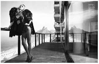
Compound Word- after making a list of words I felt uniquely described Mario Sorrenti's style, the two words I ended with were DRAMATICALLY SEDUCTIVE, and these are some of the font studies I did with them:
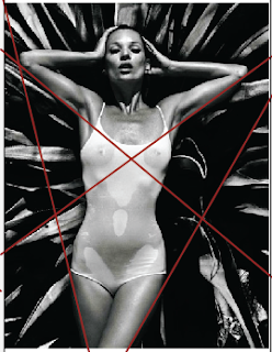
PHOTO DISSECTIONS-
COMBINATION OF Compound Word and Key Image-
INITIAL SPREAD CONCEPTS-
Subscribe to:
Comments (Atom)


