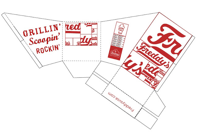
This is the fry container prototype, which is 'green design' because it is all one piece and requires no glue or fasteners in order to stay together.
Thanks to everyone who is interested in my blog. It will be documenting my process in Design school at KU. I hope everyone enjoys it, and feel free to comment on anything you see.
Tuesday, January 31, 2012
Prototype
I had to incorporate the pattern designs I had come up with by using Freddy's existing imagery and editing it, and apply it to a template for a prototype.
Thursday, January 26, 2012
Original Mock-ups
These are a few of the simple mock-ups I came up with to solve the problem of having nowhere to put the condiments. Most of the designs involve flaps or little trays that come out of the container that give you a place to put ketchup/mustard, while still being compact. We haven't started on design aspects at this point.
Wednesday, January 25, 2012
Book Cover Redesign
Book Cover Redesign
For this project, we are taking a group of three books that we feel have a relevant connection to each other such as a similar theme, time period, or author. We have to take these books and redesign their covers in a way that is cohesive, creative, and a new viewpoint that hasn't been used before.
The three books I decided on are The Book Thief by Markus Zusak, The Devil's Arithmetic by Jane Yoder, and A Separate Peace by John Knowles. They are all related in that they are all focused around youth in the time of the world wars, their coming of age stories, and how the role the past plays in their presents and futures.
Here is the initial research I've done on the novels:
Friday, January 20, 2012
Packaging Redesign
The purpose of this project is to take an existing fast food packaging experience and try to improve on that experience by changing the appearance, utility, and eco-friendliness of the packaging.
I chose Freddy's Frozen Custard and Steakburgers as the packaging I wanted to redesign.
Here are pictures of the initial experience I had when I visited Freddy's:
I chose Freddy's Frozen Custard and Steakburgers as the packaging I wanted to redesign.
Here are pictures of the initial experience I had when I visited Freddy's:
The main issues that I had with the packaging were that the color palette was very simple; using mainly white, black and red. I also found that while I liked the slanted opening of the fry container, it was a little too skinny and that made it somewhat difficult to get the fries at the bottom. The hamburger package was a complete fail because it looked like a normal clamshell box, but for some reason it was very difficult to work with and to get the burger in and out of it. Another issue I came across, as I'm sure many others have as well, is that there is no way of dipping the fries in condiments because there is nowhere to put them. So unless you want to make a complete mess, especially while driving, you have to eat your fries without and dressing. I did appreciate that most of their materials, apart from the soda cup, were recyclable and biodegradable.
Subscribe to:
Posts (Atom)


